> For the complete documentation index, see [llms.txt](https://docs.kozmik.io/llms.txt). Markdown versions of documentation pages are available by appending `.md` to page URLs; this page is available as [Markdown](https://docs.kozmik.io/screens-and-elements/button-types.md).
# Button Types
The buttons enable the actions you specify with user interaction to take place.
It enables actions such as opening a new screen or link, saving, deleting, and canceling, as well as actions such as calling, sending messages and e-mails.
### Button and Button Group
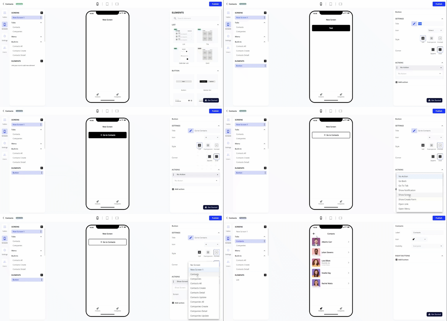
You can add a button to the screen with the Button element, and two buttons with different functions side by side with the Button Group element.
#### Button Settings
**Title**: Write the text you want to show on the button.
**Icon**: You can add it to the button by choosing one of the icon options.
**Actions**: [Learn more about actions](/screens-and-elements/actions.md)
You can customize the button appearance with Style and Corner selections.
### Phone Button
It allows the user to directly make a call or send a message if the button is pressed.
### Email Button
It allows the user to send email directly if the button is pressed.
### Link Button
If the user presses the button, it allows the user to reach the link you specified directly through the web browser.